參見: Layouts in Flutter
程式碼參見:pavlova、sizing、row_column、
grid_and_list、bottom_navigation_demo.dart
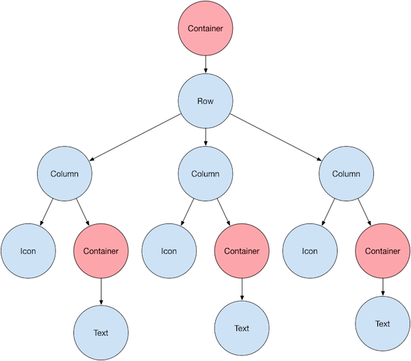
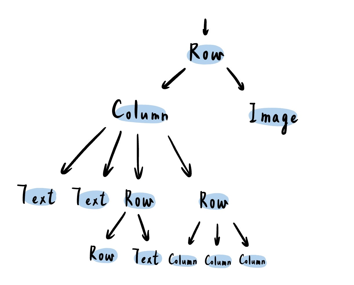
一、元件樹
通常在Flutter中,我們使用的元件會有相互層遞的父子關係,每個圓圈都代表一個元件群,我們在撰寫程式時也可以透過類似的書寫方式來釐清元件間的關聯
越上層是包裹越外圍的元件
越下層是包裹越內層的元件
葉子的部分則為單一元件
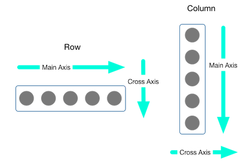
二、Row與Column
通常我們在規劃構圖時,都會針對「水平(Row)、垂直(Column)」進行組件的分割。以下圖為例,可以看到不同的Row與Column規劃,並且圖中的紅框皆代表同一Row、綠框皆代表同一Column
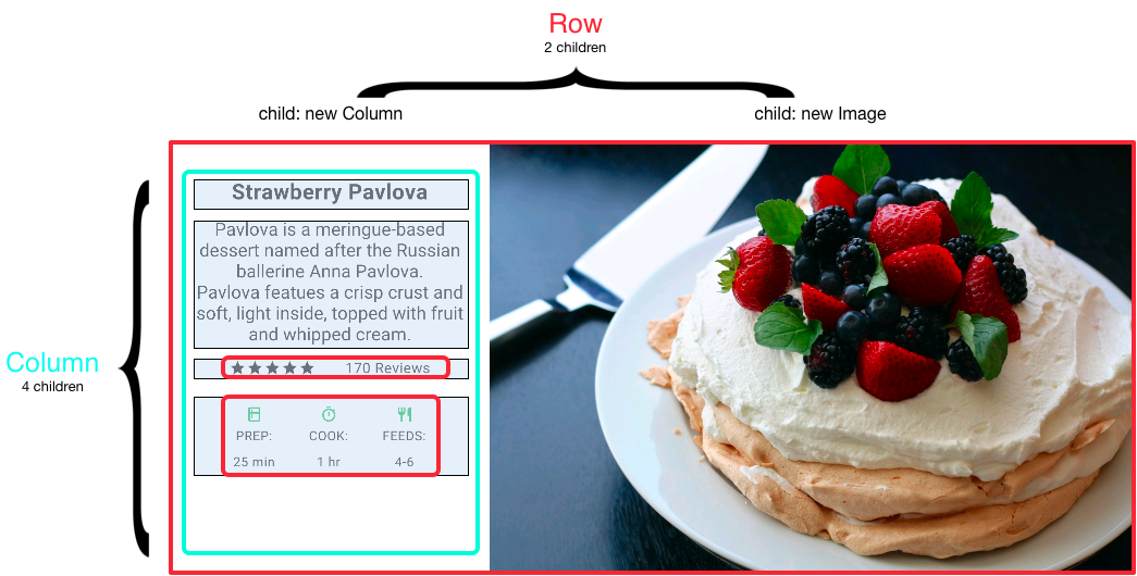
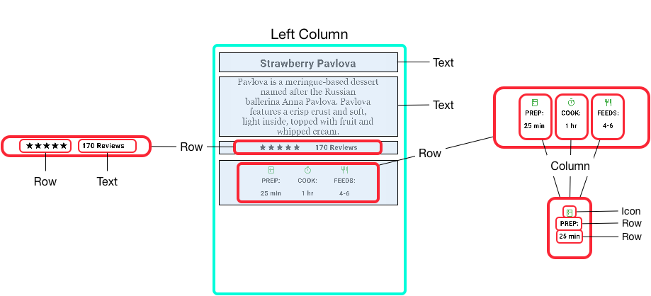
而按照同樣邏輯,我們可以把綠框內的元件再行細分為不同的Row與Column組成,直到我們的目標對象已經是獨立元件或是群組為止。
如果以元件樹的方式概略可以畫為下圖
同時,Flutter也提供更為方便的元件來管理Row與Column的行為,像是ListTile與ListView等。
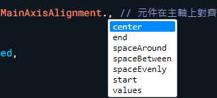
在Row與Column中,Flutter也提供了對齊的元件,mainAxisAlignment與crossAxisAlignment,並且我們在定義Main Axis與Cross Axis時會針對目前的”主方向”而定
並且,提供不同的對齊方式
center: 置中
end: 靠近尾端
start: 靠近起點
spaceAround: 去除子元素空間的均分,兩端有留空
spaceBetween: 兩端貼齊頭與尾,中間元件空間均分
spaceEvenly: 所有空間均分,兩端有留空
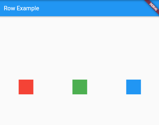
Row 的 mainAxisAlignment使用範例
1
2
3
4
5
6
7
8
9
10
11
12
13
14
15
16
17
18
19
20
21
22
23
24
25
26
27
28
29
30
31
32
33
34
35
36
37
38
39
40
| import 'package:flutter/material.dart';
void main() {
runApp(MyApp());
}
class MyApp extends StatelessWidget {
@override
Widget build(BuildContext context) {
return MaterialApp(
home: Scaffold(
appBar: AppBar(
title: const Text('Row Example'),
),
body: Center(
child: Row(
mainAxisAlignment: MainAxisAlignment.spaceAround, // 元件在Row主軸上對齊方式,空間的均分,兩端有留空
children: <Widget>[
Container(
color: Colors.red,
width: 50.0,
height: 50.0,
),
Container(
color: Colors.green,
width: 50.0,
height: 50.0,
),
Container(
color: Colors.blue,
width: 50.0,
height: 50.0,
),
],
),
),
),
);
}
}
|
Row 的 mainAxisAlignment使用範例
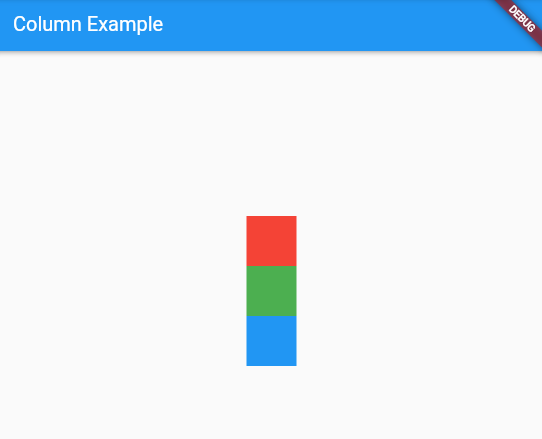
Column 的 mainAxisAlignment使用範例
1
2
3
4
5
6
7
8
9
10
11
12
13
14
15
16
17
18
19
20
21
22
23
24
25
26
27
28
29
30
31
32
33
34
35
36
37
38
39
40
| import 'package:flutter/material.dart';
void main() {
runApp(MyApp());
}
class MyApp extends StatelessWidget {
@override
Widget build(BuildContext context) {
return MaterialApp(
home: Scaffold(
appBar: AppBar(
title: const Text('Column Example'),
),
body: Center(
child: Column(
mainAxisAlignment: MainAxisAlignment.center, // // 元件在Row主軸上對齊方式,置中
children: <Widget>[
Container(
color: Colors.red,
width: 50.0,
height: 50.0,
),
Container(
color: Colors.green,
width: 50.0,
height: 50.0,
),
Container(
color: Colors.blue,
width: 50.0,
height: 50.0,
),
],
),
),
),
);
}
}
|
Column 的 mainAxisAlignment使用範例
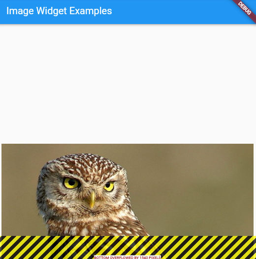
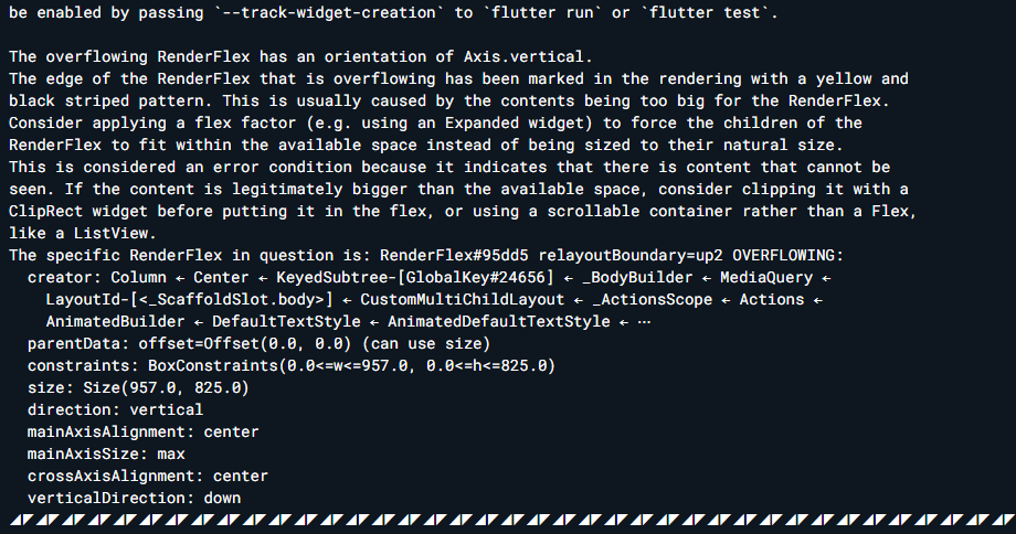
在Flutter中,若是使用的元件在呈現上超過了頁面大小,會出現Error與在畫面上呈現黃黑交錯的膠條,這個時候,我們可以選擇使用Expanded元件來避免這個問題
Expanded元件使用方式
1
2
3
4
5
6
7
8
9
10
11
12
13
14
15
16
17
18
19
20
21
22
23
24
25
26
27
28
29
30
31
32
33
34
35
36
37
38
39
40
41
42
43
44
| import 'package:flutter/material.dart';
void main() {
runApp(MyApp());
}
class MyApp extends StatelessWidget {
@override
Widget build(BuildContext context) {
return MaterialApp(
home: Scaffold(
appBar: AppBar(
title: const Text('Row Example'),
),
body: Center(
child: Row(
crossAxisAlignment: CrossAxisAlignment.center,
children: [
Expanded( //使用Expended元件,避免圖片超過大小而出現Error
child: Image.network(
'https://flutter.github.io/assets-for-api-docs/assets/widgets/owl.jpg',
fit: BoxFit.cover, //圖片填充方式
),
),
Expanded(
flex: 2,//可以更改係數來調整圖片格式,預設為1
child: Image.network(
'https://flutter.github.io/assets-for-api-docs/assets/widgets/owl.jpg',
fit: BoxFit.cover,
),
),
Expanded(
child: Image.network(
'https://flutter.github.io/assets-for-api-docs/assets/widgets/owl.jpg',
fit: BoxFit.cover,
),
),
],
),
),
),
);
}
}
|
Expanded元件使用方式
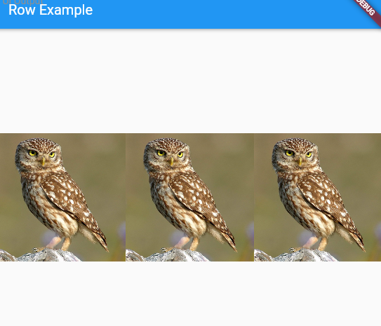
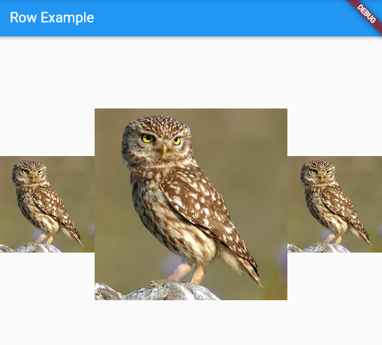
我們也可以更改flex係數,來改變圖片呈現的大小比例,例如我們在剛剛的程式碼第二張圖片加上flex: 2的描述
可以看到第二張圖片的呈現比例變大,具有凸顯的效果
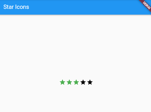
有時候,我們會需要元件間的距離更為緊密,例如: 製作星等的效果。那麼,我們就可以用mainAxisSize: MainAxisSize.min的指定方式,將Row的主軸設為最小,以達成此效果
星等包裝使用方式
1
2
3
4
5
6
7
8
9
10
11
12
13
14
15
16
17
18
19
20
21
22
23
24
25
26
27
28
29
30
| import 'package:flutter/material.dart';
void main() {
runApp(MyApp());
}
class MyApp extends StatelessWidget {
@override
Widget build(BuildContext context) {
return MaterialApp(
home: Scaffold(
appBar: AppBar(
title: const Text('Star Icons'),
),
body: Center(
child: Row(
mainAxisSize: MainAxisSize.min,
children: [
Icon(Icons.star, color: Colors.green[500]),
Icon(Icons.star, color: Colors.green[500]),
Icon(Icons.star, color: Colors.green[500]),
const Icon(Icons.star, color: Colors.black),
const Icon(Icons.star, color: Colors.black),
],
),
),
),
);
}
}
|
星等包裝使用方式