壹、Material/Cupertino 組件與手勢說明

參見: Building user interfaces with Flutter

一、Using Material Components

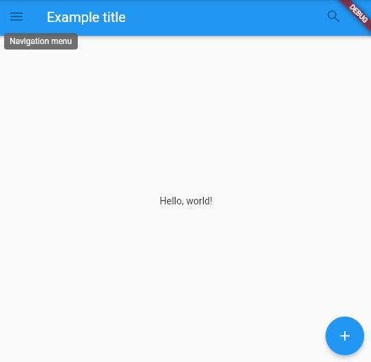
經過Basic Widgets的介紹後,相信大家已經對Material組件的樣貌十分熟悉。而我們在規劃App的架構時,便會先思考產品頁面欲呈現的區塊的功能,並依照需求放置「靜態」元件,待頁面放置確認後,再循序添加互動、頁面跳轉等功能。下方即是一個基本的Scaffold,放置靜態元件的頁面規劃範例。

AppBar

  • leading: Navigation menu(側邊導航欄菜單)

  • title: 標題文字

  • actions: 搜尋按鈕

body: “Hello World” 文字串
floatingActionButton: 浮動加號按鈕

Material Widgets使用範例

1
2
3
4
5
6
7
8
9
10
11
12
13
14
15
16
17
18
19
20
21
22
23
24
25
26
27
28
29
30
31
32
33
34
35
36
37
38
39
40
41
42
43
44
45
46
47
48
49
50
import 'package:flutter/material.dart';

void main() {
runApp(
const MaterialApp(
title: 'Flutter Tutorial',
home: TutorialHome(),
),
);
}

class TutorialHome extends StatelessWidget {
const TutorialHome({super.key});

@override
Widget build(BuildContext context) {
// Scaffold is a layout for
// the major Material Components.
return Scaffold(
appBar: AppBar(
leading: const IconButton(
icon: Icon(Icons.menu),
tooltip: 'Navigation menu',
onPressed: null,
),
title: const Text('Example title'),
actions: const [
IconButton(
icon: Icon(Icons.search),
onPressed: null,
),
IconButton(
icon: Icon(Icons.search),
tooltip: 'Search',
onPressed: null,
),
],
),
// body is the majority of the screen.
body: const Center(
child: Text('Hello, world!'),
),
floatingActionButton: const FloatingActionButton(
tooltip: 'Add', // used by assistive technologies
onPressed: null,
child: Icon(Icons.add),
),
);
}
}

Material Widgets使用範例

  • 輸出結果

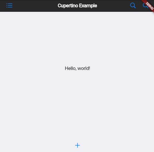
二、Using Cupertino (iOS-style) Widgets

通常我們稱Material Components為” Android Style “的組件樣貌,若是今天想要創建IOS-style的組件,即可參考Cupertino (iOS-style) widgets的使用方式!

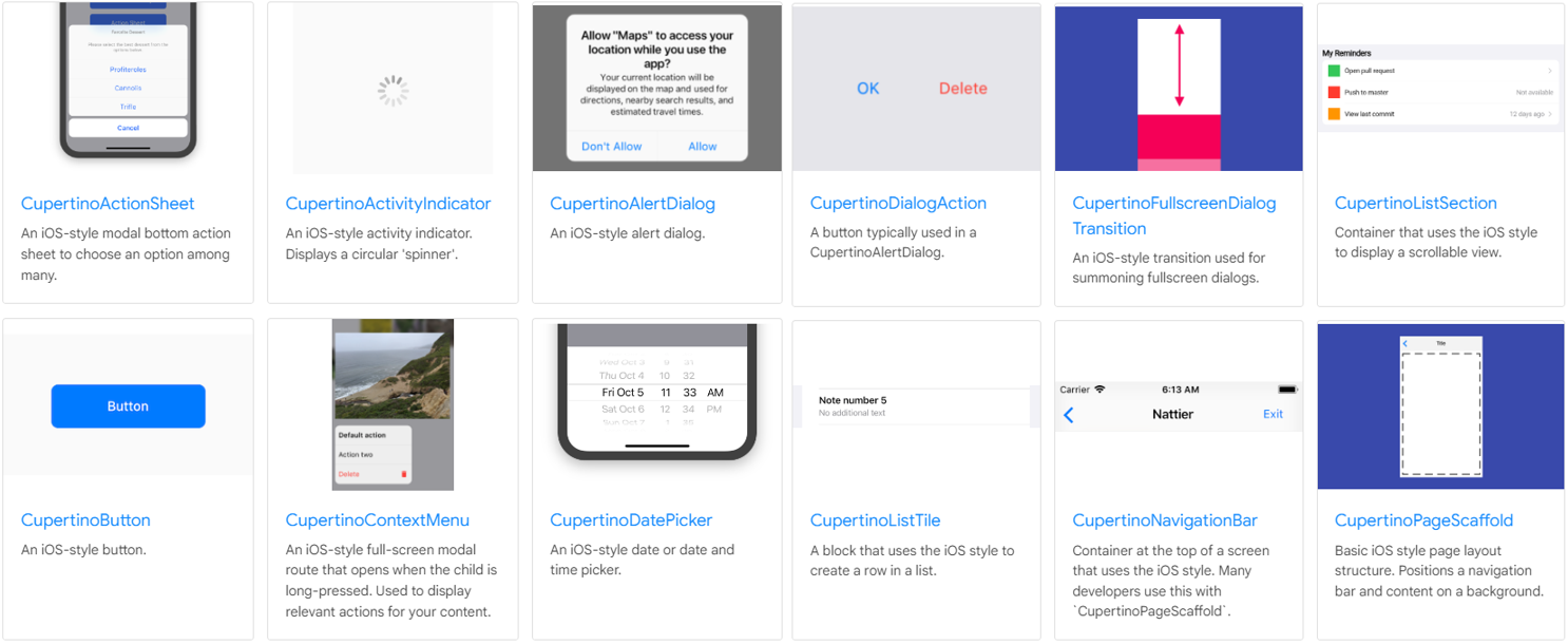
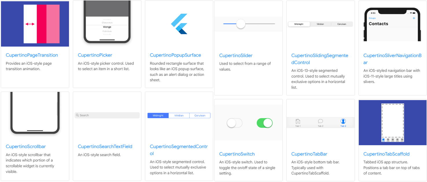
參見: Cupertino (iOS-style) widgets

Cupertino widgets使用範例

我們把剛剛的Material Scaffold佈局換成Cupertino的寫法,由輸出結果可以看到兩者的元件在繪製與程式使用上的差異,而在使用Cupertino元件時,則需要引入對應套件,import ‘package:flutter/cupertino.dart’;

1
2
3
4
5
6
7
8
9
10
11
12
13
14
15
16
17
18
19
20
21
22
23
24
25
26
27
28
29
30
31
32
33
34
35
36
37
38
39
40
41
42
43
44
45
46
47
48
49
50
51
52
53
54
55
56
57
58
59
60
61
62
63
64
import 'package:flutter/cupertino.dart';//引入Cupertino套件

void main() {
runApp(
const CupertinoApp(
title: 'Flutter Tutorial',
home: TutorialHome(),
),
);
}

class TutorialHome extends StatelessWidget {
const TutorialHome({Key? key}) : super(key: key);

@override
Widget build(BuildContext context) {
return CupertinoPageScaffold(
navigationBar: CupertinoNavigationBar(
leading: CupertinoButton(
padding: EdgeInsets.zero,
onPressed: () {},
child: const Icon(CupertinoIcons.list_bullet),
),
middle: const Text('Example title'),
trailing: Row(
mainAxisSize: MainAxisSize.min,
children: [
CupertinoButton(
padding: EdgeInsets.zero,
onPressed: () {},
child: const Icon(CupertinoIcons.search),
),
CupertinoButton(
padding: EdgeInsets.zero,
onPressed: () {},
child: const Icon(CupertinoIcons.search),
),
],
),
),
child: Container(
color: CupertinoColors.white,
child: Column(
children: [
const Expanded(
child: Center(
child: Text(
'Hello, world!',
style: TextStyle(
color: CupertinoColors.black,
),
),
),
),
CupertinoButton(
onPressed: () {},
child: const Icon(CupertinoIcons.add),
),
],
),
),
);
}
}

Cupertino widgets使用範例

  • 輸出範例

三、Handling gestures: 手勢處理

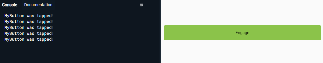
  • 在互動上,我們使用GestureDetector,處理使用者進行觸摸、點擊、拖動等手勢事件,並使用onTop()設定回傳的操作。

  • 它也常被用於許多其他元件中,像是IconButton、ElevatedButton和FloatingActionButton等,所具有onPressed(),就是處理點擊時將相應的操作。

GestureDetector使用範例

在此範例中,我們用onTop()設定當使用者點擊時,會輸出’MyButton was tapped!’文字到終端機中

1
2
3
4
5
6
7
8
9
10
11
12
13
14
15
16
17
18
19
20
21
22
23
24
25
26
27
28
29
30
31
32
33
34
35
36
37
38
import 'package:flutter/material.dart';

class MyButton extends StatelessWidget {
const MyButton({super.key});

@override
Widget build(BuildContext context) {
return GestureDetector(
onTap: () { //點擊時,在終端機輸出文字
print('MyButton was tapped!');
},
child: Container(
height: 50,
padding: const EdgeInsets.all(8),
margin: const EdgeInsets.symmetric(horizontal: 8),
decoration: BoxDecoration(
borderRadius: BorderRadius.circular(5),
color: Colors.lightGreen[500],
),
child: const Center(
child: Text('Engage'),
),
),
);
}
}

void main() {
runApp(
const MaterialApp(
home: Scaffold(
body: Center(
child: MyButton(),
),
),
),
);
}
  • 輸出結果

左邊是終端機畫面,右邊是頁面畫面,此為按下五次按鈕後的樣子